


 58 / 76

Februarie 2015
56
RELEVANT
The area of wheat grown in the same
year by 3,925 South African producers
averaged 154 hectares per producer
(DAFF, 2011). This shows that the Australian
producers grew almost three times the
number of hectares of wheat than the South
African producers.
On those hectares each Australian grower
produced on average 1,005 tons of wheat
which was twice or 100% greater than the
amount of 505 tons produced by each South
African producer. Australian producers
were more profitable because they were
able to spread their overhead costs over a
much larger number of units of output.
Conclusions
The analysis provided an illustration that
South African wheat producers are not that
bad off when compared to a major wheat
producing country such as Australia. In
some instances, South African producers
outperformed Australian producers with
specific reference to market prices, yield
levels and hence, profitability.
Thus, from the analysis one could ask
the question why the area has declined
substantially when local producers can
compete against major global players
such as Australia. This is due to a number
of reasons. The long-term reduction in
areas sown to wheat in South Africa was
due to reductions in plantings by dryland
producers in the summer rainfall region.
This is primarily due to a lower number of
hectares being sown to wheat over time
by producers in the Free State. Climatic
conditions and more favourable returns
in crops such as maize and soybeans
in the Free State mitigated strongly against
wheat production.
Graph 8
proves that the gross returns
(price multiplied by yield) for maize and
more recently soybeans have outpaced
wheat, making the former more favourable
crops to cultivate.
The comparison of the South African wheat
producer compared with the Australian
grower revealed that the latter continued to
grow wheat and actually increased the
area sown because they enjoyed large
economies of size.
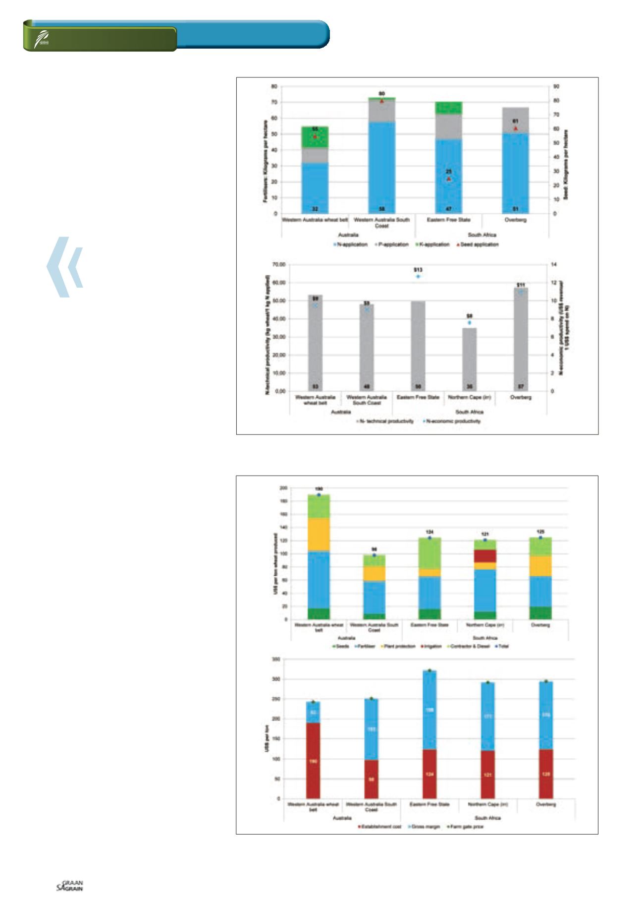
Graph 6: Fertiliser application and seed application rates and productivity indicators in Australia and
South Africa.
Source: BFAP, 2014 and agri benchmark, 2014
Graph 7: Establishment cost in US$ per ton wheat produced and gross margins in Australia and
South Africa.
Source: BFAP, 2014 and agri benchmark, 2014
How do we
compare with
“down under”?